
Why Paint Colours Look Different at Home—and How to Test Them
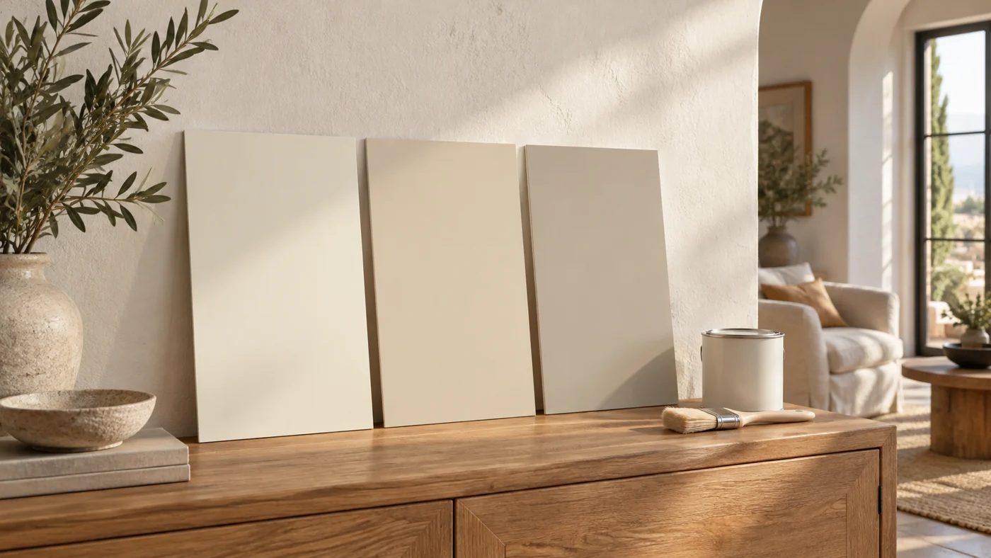
AI-generated editorial illustration of paint sample boards in a room; not a real product swatch or a calibrated colour comparison.
- 1. A paint colour does not travel alone
- 2. White has relatives: meet the undertone
- 3. Make a shortlist—not a paint-sample museum
- 4. Get a meaningful physical sample
- 5. Use the three-place, three-time test
- 6. The finish and the screen are not small details
- 7. Before repainting, ask one better question
- 8. Copy this decision note before you buy
You choose a lovely soft white in the shop. At home, it looks suspiciously like vanilla pudding. The grey you nearly bought has a second career as pale blue. Nothing about decorating prepared you for a wall with this much personality.
Paint can look different because the light, surroundings, surface and viewing conditions are different. That does not automatically mean the shop mixed it incorrectly. Before blaming the tin—or buying another one—test the colour where you will actually live with it.
This guide gives you a small, manageable decision process: a shortlist, three testing positions, three useful viewing times and a note that turns “something feels off” into a question you can answer.
1. A paint colour does not travel alone
A wall reflects the light reaching it. Change the light and the appearance can change too. NIST’s explanation of light reflection describes how illumination and the way materials reflect and scatter light shape their appearance.
Think of the shop chip as an introduction, not the whole relationship. Your room has a floor, curtains, corners and evening lamps. The useful question is not “Which white is objectively best?” It is “Which one works with the room I already have?”
2. White has relatives: meet the undertone
An off-white can lean creamy, pinkish, greenish or greyish. Those subtle tendencies are often called undertones. Sherwin-Williams’ undertone guide recommends comparisons rather than judging a colour alone; lighting also matters. A neutral-looking sample is not guaranteed to remain neutral in every room.
Try describing what bothers you without judging it yet: “too creamy beside the door,” “too cold behind the sofa,” or “good in daylight, dull at dinner.” Those are useful observations. “Ugly” gives you considerably less to work with.
3. Make a shortlist—not a paint-sample museum
Our suggested starting limit is three candidates. It is a way to keep the decision manageable, not a scientific rule. Choose a direction first: quiet and warm, crisp and light, or deliberately colourful. Then reject anything that does not fit that intention.
Write down what stays in the room: perhaps the brown sofa, stone floor and white doors. If the budget covers paint but not a new sofa, the existing sofa gets a vote. An inspiration photograph should not silently add five furniture purchases to the project.
Give the candidates neutral labels—A, B and C. Keep the product name and code on the back. “Morning Cloud” sounds persuasive; “B” has to earn your affection honestly.
4. Get a meaningful physical sample
Small chips help narrow the choice, but a larger physical sample lets you judge more of the colour at once. Benjamin Moore’s sampling guide describes painted movable boards and larger samples, viewed upright and in different lighting. Follow the sample product’s directions for preparation, coats and drying.
Ask your supplier what the sample does—and does not—represent. Do not assume a sample pot is suitable as the finished coating. Keep the paint code, product line and intended finish together so your eventual order is unambiguous.
For an owned wall, agree on an appropriate test area and preparation. For a rented home, ask permission before painting patches. A sample that saves you one repaint should not create a different repair job.
5. Use the three-place, three-time test
Here is Dajran’s practical organising method, not a laboratory protocol. Take the same sample to three meaningful positions in your room:
- Near the window: see it in the light that reaches the room.
- In a more shaded position: check the area you might otherwise ignore.
- Beside something that stays: the sofa, tile, door or a large cabinet.
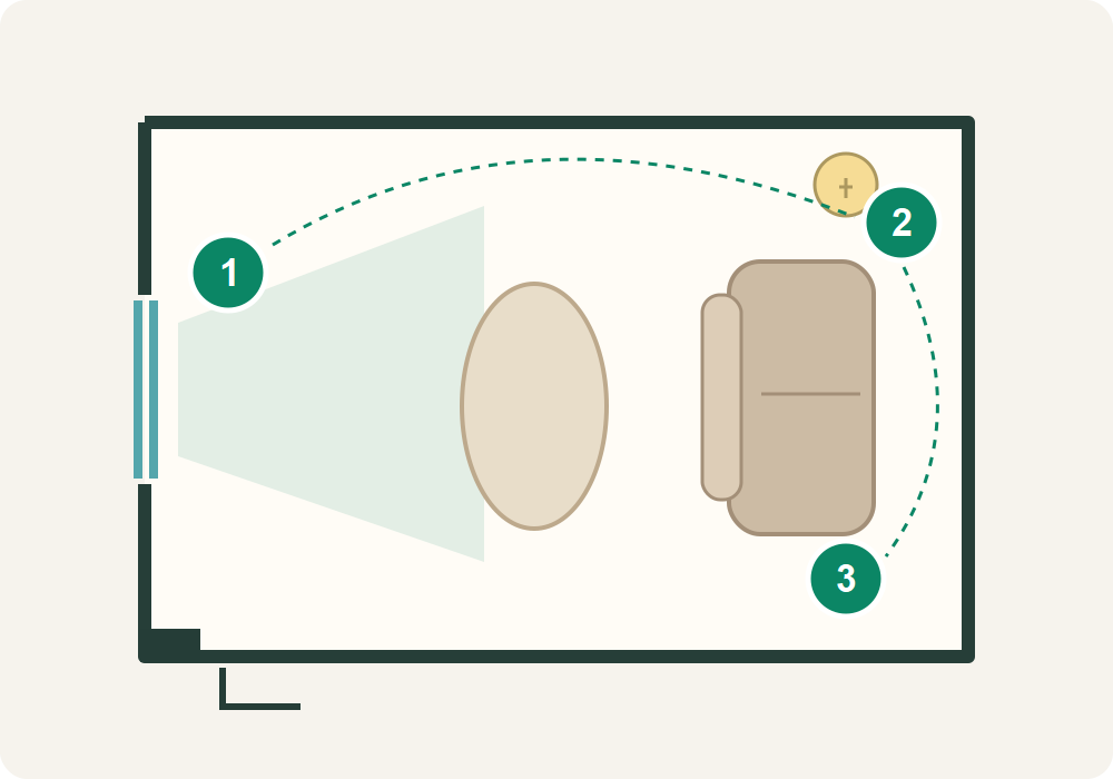
Repeat at morning, midday and evening, using your normal lamps after dark. Adjust the schedule to when you use the room; a bedroom does not need to win a lunchtime beauty contest. Do not compare A only in sunshine and B only at night, then call it a fair competition.
Write one short observation per check. For example: “B / beside sofa / evening: comfortable, but creamier than wanted.” This suggested note format separates the sample, location, time and reaction without requiring a spreadsheet.
6. The finish and the screen are not small details
A sample is not a promise that every product and finish will look identical. Benjamin Moore’s FAQ notes that product, sheen and lighting can affect the result, and that screen and printed colours may differ from actual paint.
Use online images to choose a direction, then make the buying decision with a physical sample. A virtual room preview is a helpful sketch, not an insurance policy. Confirm the final specification with the supplier rather than matching a screenshot.
7. Before repainting, ask one better question
Imagine a room that feels pleasant all day but too yellow after the lamps go on. This is a hypothetical example, not a home we tested. Ask: “Do I dislike the paint, or do I dislike the whole evening scene?” Examine the sample under your existing lamps before deciding what to change.
NIST’s lighting research distinguishes faithful colour rendering from what people prefer. A technically impressive light specification does not automatically make a room feel right to you. If you want to explore the lighting separately, our living-room lighting guide focuses on placement and glare.
If a dried test looks very different from the agreed sample, stop and show the supplier the code, product, finish and test conditions. “It must be the light” is no more useful than immediately accusing the shop. Check the actual order too.
8. Copy this decision note before you buy
- The feeling I want: calm, warm, fresh—or something else specific.
- The things that stay: floor, sofa, doors and large furniture.
- My chosen sample: name, code, brand, product and intended finish.
- Its weak spot: where or when I liked it least, and whether that matters.
- My final check: I saw it dry, upright and under the room’s usual light.
Choose a colour you can comfortably live with in the conditions that matter to you, not one that wins a single photograph. And if all three candidates fail? Change the shortlist, not the entire room. A few more observations are less dramatic than discovering your “soft white” has moved in as custard.
Image disclosure: the cover is an AI-generated illustration made for this article. The testing plan is an original schematic; its colours are illustrative, not paint samples to purchase from.



What do you think?
Share your thoughts or experience. Keep the conversation kind and on topic.
Participation Rules
نريدك أن تكون مصدرًا لزملائك من القراء ونأمل أن تستخدم قسم التعليقات لإجراء ذلك. لقد صممناها لرفع وتوسيع الاستجابات الأكثر ذكاءً وإدانةً ، وتقليل أو إخفاء الأسوأ. هذه هي قواعد الطريق:
ابقى في صلب الموضوع
عند تقديم تعليق ، لا تخرج عن الموضوع. لا تعلق على المعلقين الآخرين أو معتقداتهم السياسية المفترضة. ناقش مزايا القصة نفسها. لا تنشر تومي. هذا ليس المكان المناسب لصق فصل من رسالتك (أو أي شخص آخر) أو ورقة بيضاء.
أظهر الإحترام.
نحن نشجع ونقدر النقاش العميق. ما عليك سوى التأكد من أنه عندما لا تتفق مع فرضية القصة أو أي معلق آخر ، فإنك تفعل ذلك بطريقة محترمة ومهذبة.
كن مهذبا وحافظ على نظافته
نحن نغطي التكنولوجيات الجديدة موقعنا ليس منفذاً للفظاظة. نحن لا نتسامح مع الإهانات الشخصية ، بما في ذلك استدعاء الأسماء أو العنصرية أو التمييز الجنسي أو الكلام الذي يحض على الكراهية أو الفحش. هذا يعني أنه لا توجد أي ملاحظات بذيئة أو مسيئة أو مضايقة أو تنمر. إذا لم تكن مدنيًا ومهذبًا ، فلا تنشره.
تجاهل المتصيدون
أفضل رد على القزم - شخص ما يتكرر عدائيًا واستفزازًا - ليس ردًا. من فضلك لا تشجع السلوك السيئ عن طريق الاستجابة ؛ انها لا تخدم سوى لسرور المتصيدون والبيض عليها. إذا كان هناك شخص ما يسيء استخدام موضوع مناقشة ، فأبلغ عن أي تعليقات مسيئة ، وسنتناول الموقف.
كن مسؤولاً وأصيلاً
انشر آرائك فقط بكلماتك الخاصة. أنت مسؤول عن المحتوى الذي تنشره.
لا تنشر رسائل غير مرغوب فيها أو إعلانات
إذا لم يكن لديك عقد إعلان معنا ، فإن هذا الموقع الإلكتروني ليس عبارة عن لوحة إعلانات لنشاطك التجاري. لا تنشر محتوى غير مرغوب فيه أو محتوى ترويجي ذاتي أو حملات إعلانية. لا ضغط أو تجنيد أو استجداء.
نقرأ التعليقات
على الرغم من أن مجالس مناقشاتنا لا تخضع للإشراف الرسمي ، إلا أننا نولي اهتمامًا وثيقًا بها. نحتفظ بالحق في تعديل أو حذف التعليقات التي لا تلبي معاييرنا.
نحن نحظر الأعضاء الفاضحين
إنه ليس شيئًا نتمتع به. ولكن عند الضرورة ، سنحظر الأعضاء الذين لا يلتزمون بهذه الإرشادات.
شكرا على اتباع هذه المبادئ التوجيهية.