Blurry Logo? Ask for These Files, Not Another Screenshot
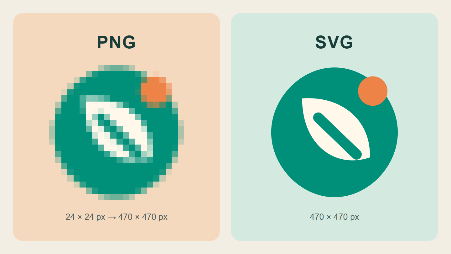
Original sample mark: a 24-pixel PNG deliberately enlarged to reveal pixels, beside SVG shapes rendered at the same display size. Method and limitations explained below.
- Separate the editable original from everyday exports
- What PNG, JPEG, SVG, and PDF actually tell you
- Read the enlargement example without blaming PNG
- Check transparency on a background that reveals it
- Build a folder that makes the next handover easy
- A clearer message to send your designer
- Approve the use, not just the download
- Keep a tiny record for the next person
Your logo looks fine in a small chat preview. Then the café menu needs printing, someone enlarges the image, and the edges turn into stairs. Asking for “the same picture, but clearer” can start a surprisingly long conversation.
A more useful request is a small, organised set of files for the jobs you actually do. Here is how to ask for it, check what arrived, and stop treating one screenshot as your entire brand folder. The illustrations use an invented sample mark, not a real client project or a redesign of Dajran.
Separate the editable original from everyday exports
Think of two different needs. You want an original that the designer can maintain, and copies that work in a website, presentation, social profile, or print layout. One file does not have to serve every purpose.
Adobe explains the key distinction: raster artwork is built from pixels, while vector shapes are described by paths and curves that can be scaled. That is why the construction of the artwork matters—not only the letters after its filename.
For a fictional bakery, an everyday PNG for a slide might be completely adequate. That same bakery should not have to reconstruct its sign from a tiny profile picture. Keep the agreed editable original and the practical exports together, with a note saying which is which.
What PNG, JPEG, SVG, and PDF actually tell you
- PNG: a pixel image that can support transparency. Useful when an app needs a normal image, but its dimensions still matter.
- JPEG: a pixel image often used for photographs; ordinary JPEG does not support a transparent background.
- SVG: commonly used for scalable vector graphics, including simple logo artwork on the web.
- PDF: a document to inspect, not a guarantee that the logo inside is vector artwork.
MDN’s image-format reference documents the PNG/JPEG/SVG distinctions. Adobe’s raster-versus-vector guide also notes that PDFs can be raster-based. A screenshot placed inside a PDF has not gained the missing detail.
There is a similar trap with SVG: an SVG can include raster images. Ask whether the logo itself consists of editable vector shapes, rather than assuming the extension settles the question. You do not need to learn coding to ask that.
Read the enlargement example without blaming PNG
For the cover comparison, we created a simple geometric mark. One side is a 24 × 24-pixel PNG displayed at 470 × 470 pixels. The other renders the original SVG shapes at that same display size. We deliberately used nearest-neighbour, or pixelated, enlargement on the small PNG so its grid is easy to see.
This is a controlled illustration, not a screenshot of a customer’s failed sign. Ordinary software may smooth an enlarged bitmap instead, so the failure can look soft rather than blocky. And a sufficiently large PNG can look perfectly sharp at its intended display size. The lesson is not “PNG is bad.” It is “do not ask a tiny export to supply detail it does not contain.”
The published comparison is itself a flat WebP image. It shows the result of the demonstration; it is not a downloadable vector logo or a test of a particular printer.
Check transparency on a background that reveals it
A logo that looks fine on white may arrive with a white rectangle attached. Try it over a contrasting background in the app you plan to use. A genuinely transparent area lets that background show through; a white area stays white.
In our example, both files share the same format. Only one has the transparency you wanted. That is a good reason to test the actual file rather than approving a thumbnail. If someone sends a picture of a checkerboard, that alone is not proof of transparency either.
Also check which color version you received. A dark mark for light backgrounds and a light mark for dark backgrounds may need separate, clearly named exports. Do not improvise a new brand color each time a background changes.
Build a folder that makes the next handover easy
Here is a proposed folder structure for our fictional bakery. The names are examples, not mandatory software settings:
- Originals: the agreed editable source, clearly marked with the approved version and date.
- Web: a suitable SVG where supported, plus requested PNG sizes and color variants.
- Print: files prepared for the printer’s specified requirements, not a random export renamed “print-ready.”
- Reference: a short preview sheet and notes explaining versions, colors, and intended uses.
Use filenames such as bakery-logo-dark-on-light-1600w.png instead of final-final-new2.png. “1600w” is only an example label: record the actual width, not a number someone copied from this article. Keep old versions in a separate archive so they do not look like current approvals.
If the package depends on fonts, linked assets, or another person’s work, ask what is included and what you are permitted to edit or share. Do not assume that receiving a preview gives you every source asset. This is a handover question, not a substitute for your agreement with the designer.
A clearer message to send your designer
Adapt this request to the work you agreed to receive:
Please organise the approved logo files by use: editable original where included in our agreement, vector artwork for suitable uses, and PNG exports at the dimensions we need. Please label light/dark-background versions and identify which PNGs are transparent. For print, I will send the printer’s requirements before you prepare the final file. Include a short note listing the approved version, dimensions, and anything needed for future edits.
Add the actual jobs: “our website header, a slide deck, a square profile image, and a printed menu,” for example. That gives the designer a task to solve. “Send all the formats” can produce a folder full of files you cannot distinguish.
Approve the use, not just the download
Before closing the project, try a few ordinary checks:
- Open the intended file in the actual website or app workflow. A format being technically capable does not mean every upload form accepts it.
- Look at the logo at its planned size, including the small size customers will really see.
- Place the transparent export on a contrasting background and check for an unwanted rectangle.
- Check the spelling and approved language version, not just the sharpness.
- For a print job, get the printer’s requirements and review a proof at the intended size. Our digital illustration is not evidence of a physical print result.
Send files as files or a clearly identified download package, not only as a screenshot in the conversation. Retain the originals when making smaller copies. If your menu also uses a QR code, our pre-print QR checklist covers a separate problem: whether that square leads where you expect.
Keep a tiny record for the next person
Put one note in the folder: approved version / date / intended uses / editable source location / contact for changes / items still to confirm. Someone reopening the job six months later should not need to reconstruct a chat history.
A clean logo export and a good product photograph solve different problems. For the photo side of your website or menu, see our small-shop phone photography guide.
Illustration note: both comparison graphics were created for this article from an original code-drawn sample mark. No stock photograph, existing brand identity, AI image, paid-client test, or physical print test is used. The rendering method and source assets were retained for verification.
The useful finish line is simple: the next time someone asks for your logo, you can send the right file with one sentence explaining what it is for—not another hopeful screenshot.
Both comparisons are original code-rendered illustrations, not AI images or client identities. Published WebP graphics are flattened; transparency belongs to the PNG samples inside the demonstration, not the published comparison itself. Both languages use the same images with localized descriptions. The website’s logo and design are unchanged.