
How to Draw a Mug: Three Things to Notice Before Adding Detail
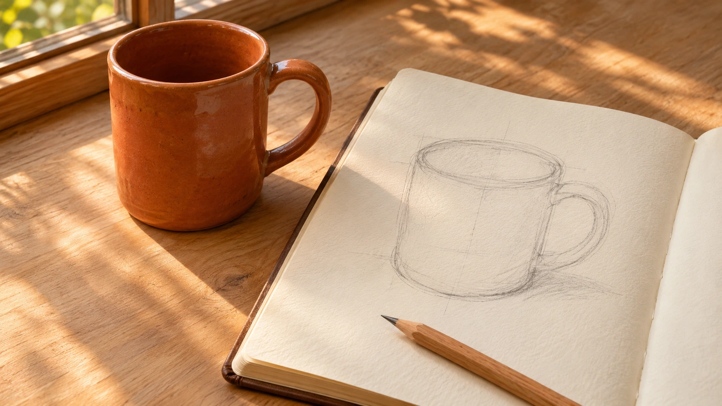
AI-generated illustration of a mug, sketchbook, and pencil; not a photograph of a documented exercise result.
- Set up a subject you can actually compare
- Compare the body’s height and width before drawing details
- Look at the opening, not the circle you know is there
- Draw the empty space inside the handle
- Use two shadow areas before trying smooth shading
- A short practice round with a clear stopping point
- When the sketch looks wrong, ask a more useful question
- Finish with one observation you can use tomorrow
You draw the handle, add a little shading, and somehow the mug still looks like a bucket. Before deciding you “can’t draw,” try a smaller question: is the body too wide, is the opening too round, or is the handle gap in the wrong place?
An ordinary cup makes a surprisingly good subject because you can put the real object beside your sketch and compare them. This beginner exercise is about looking and making a few useful corrections—not producing a flawless picture. One mug, one pencil, and one sheet of paper are enough.
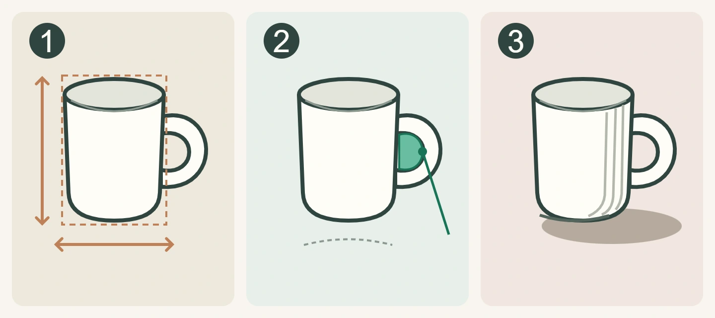
The cover is an AI-generated illustration of a drawing setup, not a photograph of a tested exercise or a reader’s result. The diagram below was created for this guide.
Set up a subject you can actually compare
Choose a plain, empty mug rather than one covered in lettering or a busy pattern. Place it on a clear surface, with the handle visible to one side and light coming mainly from a window or a lamp. Keep both the mug and your chair in the same place while you draw. If your viewpoint keeps changing, the opening and handle will seem to change too.
You do not need specialist pencils. Start lightly with a normal pencil; save dark marks for decisions you want to keep. Leave generous space around the sketch so the handle and shadow do not run into the edge of the paper. The object can be ordinary. Your attention is the interesting part.
Compare the body’s height and width before drawing details
Ignore the handle for a moment. Imagine a loose rectangle around just the body of the mug. Does it look taller than it is wide, almost square, or wider than it is tall? Mark the top, bottom, and two sides lightly on your paper. Fit the cup inside those marks.
Suppose your real mug looks slightly taller than it is wide, but your sketch looks broad and squat. Darkening the outline will not fix that relationship. Move one side inward or extend the body downward while the marks are still light. Compare the whole shape again before continuing.
This is an estimate from your chosen view, not a demand for a ruler-perfect ratio. Different mugs—and different viewpoints—need different outlines.
Look at the opening, not the circle you know is there
You know the rim is round. From a seated, angled view, however, the opening usually looks flattened. Look at how much of the inside you can actually see. Sketch that opening lightly, then check its width against the body underneath.
If the mug suddenly looks as though you are looking straight down into it, your opening may be too deep for this view. If it looks sealed shut, it may be too flat. Compare the drawing with the object rather than following a fixed “correct ellipse.” A taller viewpoint generally reveals more of the opening; a lower one reveals less.
Make the near and far edges readable, but do not spend ten minutes polishing the rim while the body is still the wrong size. The small detail cannot rescue the larger shape.
Draw the empty space inside the handle
A handle is not simply the letter C stuck to a cup. Look at the gap inside it. Is that opening tall and narrow, rounded, or almost triangular from your seat? Where does its top meet the body, and how far down does its bottom reach?
Getty’s guide to the elements of art distinguishes the space occupied by objects from the negative space around them. Here, treating the handle gap as a shape gives you something concrete to compare.
Try marking the gap first, then draw the outer edge around it. If the handle looks pasted on, check its two attachment points. If it looks too heavy, compare the thickness around the opening—not just the outside silhouette. Adjust what you can see instead of adding decoration.
Use two shadow areas before trying smooth shading
Look for the darker side of the cup and the shadow it casts on the table. Lightly block those in as broad areas. Leave the light side mostly as paper. You can use loose parallel marks; a perfectly blended finish is not the goal of this first pass.
Follow the actual light in your setup. Do not copy the diagram’s shadow direction if your window is on the other side. Notice where the cup touches the table: that small dark contact can be more useful than shading every centimetre of the page.
If your outline is already very dark, resist adding equally dark shading everywhere to “balance” it. You can make a fresh, lighter sketch instead. For more on how visual cues suggest depth, explore our guide to paintings that fool the eye.
A short practice round with a clear stopping point
Here is an optional 12-minute structure we suggest for this article, not a tested scoring system. Take longer if you prefer; the timer is only there to stop one rim taking over the whole evening.
- First two minutes: look without drawing. Find the body’s overall proportions, the visible opening, and the handle gap.
- Next four: sketch those shapes lightly. Look back at the mug after every few marks.
- Next three: add the broad dark side and the cast shadow you can see.
- Last three: choose one mismatch to correct, then put the pencil down.
The Andy Warhol Museum’s observation-drawing lesson includes slowly following a subject’s edges. Borrow that attention to the outline for a short warm-up if it helps. Our exercise does not require blind drawing, a continuous unbroken line, or copying museum artworks.
When the sketch looks wrong, ask a more useful question
- “It looks like a bucket.” Compare body width with height before changing the shading.
- “The handle feels strange.” Compare its inner opening and where it joins the body.
- “It looks flat.” Check the opening, then the light/dark difference and contact with the surface. More pencil everywhere is not automatically more depth.
- “I keep rubbing everything out.” Make a second small sketch beside the first. Test one correction rather than repairing every mark.
Keep both attempts. Write a specific observation beside the second: “Made the body narrower” is more useful next time than “This one is better.” If the comparison is difficult, take a short pause and look again from the same position.
Finish with one observation you can use tomorrow
Copy this tiny review onto the page: I noticed… / I changed… / Next time I will check… For example: “I noticed the handle gap was much narrower than I drew it. I moved its inner edge. Next time I will check the gap before shading.” That is a meaningful result even if the picture is not frame-worthy.
For the next session, use the same mug from the same position to explore one correction, or turn it slightly to see what changes. Do not change the viewpoint, light, subject, and materials all at once if you want an easy comparison. If you would rather play with a camera afterward, our light-painting guide offers a different creative project.
The aim is not to prove that you have artistic talent in twelve minutes. It is to replace “I can’t draw this” with an observation you can act on. A mug with a slightly crooked handle can still teach you something worth keeping.
The cover is AI-generated; the original explanatory diagram was made for this article. Both images are shared across languages with their proportions preserved. The diagram is simplified, not a measurement of the cover mug. The suggested timing is an editorial exercise, not a tested result or a guarantee of drawing skill.



What do you think?
Share your thoughts or experience. Keep the conversation kind and on topic.
Participation Rules
نريدك أن تكون مصدرًا لزملائك من القراء ونأمل أن تستخدم قسم التعليقات لإجراء ذلك. لقد صممناها لرفع وتوسيع الاستجابات الأكثر ذكاءً وإدانةً ، وتقليل أو إخفاء الأسوأ. هذه هي قواعد الطريق:
ابقى في صلب الموضوع
عند تقديم تعليق ، لا تخرج عن الموضوع. لا تعلق على المعلقين الآخرين أو معتقداتهم السياسية المفترضة. ناقش مزايا القصة نفسها. لا تنشر تومي. هذا ليس المكان المناسب لصق فصل من رسالتك (أو أي شخص آخر) أو ورقة بيضاء.
أظهر الإحترام.
نحن نشجع ونقدر النقاش العميق. ما عليك سوى التأكد من أنه عندما لا تتفق مع فرضية القصة أو أي معلق آخر ، فإنك تفعل ذلك بطريقة محترمة ومهذبة.
كن مهذبا وحافظ على نظافته
نحن نغطي التكنولوجيات الجديدة موقعنا ليس منفذاً للفظاظة. نحن لا نتسامح مع الإهانات الشخصية ، بما في ذلك استدعاء الأسماء أو العنصرية أو التمييز الجنسي أو الكلام الذي يحض على الكراهية أو الفحش. هذا يعني أنه لا توجد أي ملاحظات بذيئة أو مسيئة أو مضايقة أو تنمر. إذا لم تكن مدنيًا ومهذبًا ، فلا تنشره.
تجاهل المتصيدون
أفضل رد على القزم - شخص ما يتكرر عدائيًا واستفزازًا - ليس ردًا. من فضلك لا تشجع السلوك السيئ عن طريق الاستجابة ؛ انها لا تخدم سوى لسرور المتصيدون والبيض عليها. إذا كان هناك شخص ما يسيء استخدام موضوع مناقشة ، فأبلغ عن أي تعليقات مسيئة ، وسنتناول الموقف.
كن مسؤولاً وأصيلاً
انشر آرائك فقط بكلماتك الخاصة. أنت مسؤول عن المحتوى الذي تنشره.
لا تنشر رسائل غير مرغوب فيها أو إعلانات
إذا لم يكن لديك عقد إعلان معنا ، فإن هذا الموقع الإلكتروني ليس عبارة عن لوحة إعلانات لنشاطك التجاري. لا تنشر محتوى غير مرغوب فيه أو محتوى ترويجي ذاتي أو حملات إعلانية. لا ضغط أو تجنيد أو استجداء.
نقرأ التعليقات
على الرغم من أن مجالس مناقشاتنا لا تخضع للإشراف الرسمي ، إلا أننا نولي اهتمامًا وثيقًا بها. نحتفظ بالحق في تعديل أو حذف التعليقات التي لا تلبي معاييرنا.
نحن نحظر الأعضاء الفاضحين
إنه ليس شيئًا نتمتع به. ولكن عند الضرورة ، سنحظر الأعضاء الذين لا يلتزمون بهذه الإرشادات.
شكرا على اتباع هذه المبادئ التوجيهية.