
Snow Isn’t Just White: What Monet Can Teach You About Colour
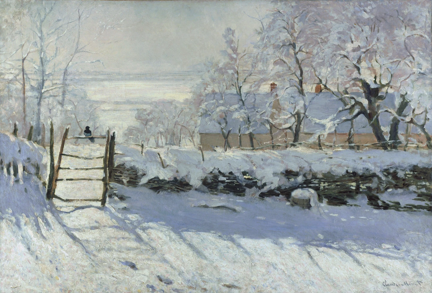
Claude Monet, The Magpie, 1868–1869: a bird on a gate amid snow and coloured shadows. Musée d’Orsay; artwork reproduction via Wikimedia Commons.
- Find the tiny bird before studying the big landscape
- Separate “which colour?” from “how light?”
- Look at the snow, not the word “white”
- Compare a second winter: the same subject can feel different
- Borrow the question, not the whole painting
- Make a small study with a useful stopping point
- Three habits that make looking more rewarding
- Artworks, sources and image credits
Ask someone to draw snow and the first plan may be simple: leave the paper white, add a few dark trees, and call it winter. Then look at Claude Monet’s The Magpie. There is snow everywhere, yet the picture is full of quiet colour. Even the shadows have something to say.
The useful lesson is not “paint everything blue.” It is to stop choosing a colour only because you know an object’s name. A white thing can need several different marks in a picture. Looking for those differences is enjoyable whether you paint, take photographs, or simply want a museum visit to feel less like walking past expensive rectangles.
Find the tiny bird before studying the big landscape
Monet painted The Magpie in 1868–1869. Musée d’Orsay’s account on Google Arts & Culture places it near Étretat and emphasizes the role of sun, shade and pale colours. This is a historical painting, not a newly discovered winter photograph.
Find the small dark bird perched on the gate toward the left. Its size makes a useful contrast with the large pale areas around it. Give yourself a moment to look at the landscape without staring at the bird. Then return to it. Does that little dark shape feel more noticeable than its size would suggest?
That is a good first question in front of any painting: not only “What is the subject?” but “Which small mark keeps bringing me back?” The answer can be a bird, a doorway or a single patch of colour—not necessarily the largest object.
Separate “which colour?” from “how light?”
Getty’s guide to the elements of art distinguishes hue, value and intensity. In everyday terms: what colour family you see, how light or dark it is, and how strong or muted it looks.
These are different choices. A pale blue and a dark blue belong to the same broad colour family, but they do very different work in a picture. A quiet grey-blue is also different from a vivid blue that dominates everything beside it.
When a painted snowfield looks flat, adding more detail may not be the first answer. Ask whether its light and shaded areas have become too similar. Then ask whether the colour is too strong. Those questions are more specific than “It needs to look more realistic.”
Look at the snow, not the word “white”
In the cover painting, compare an open bright patch with the broad shadowed area in front of the fence. In this reproduction, the shaded snow reads as cooler and darker, while some illuminated areas look warmer. The surface is still read as snow rather than as a field painted in unrelated stripes.
Try moving your attention between three places: the snow above the fence, the foreground shadow, and the pale sky. Do not worry about finding the perfect colour name. “This part looks cooler than that one” is already a meaningful comparison.
The point is a relationship, not a recipe. A blue pencil does not automatically make a convincing shadow, and black is not forbidden. What matters in your own picture is what you are observing and how one area sits beside another.
A screen reproduction is useful for these comparisons, but it is not a calibrated record of the original paint. Display settings, brightness and the image file can change the colours you see. Treat them as clues to look at, not exact paint-mixing instructions.
Compare a second winter: the same subject can feel different
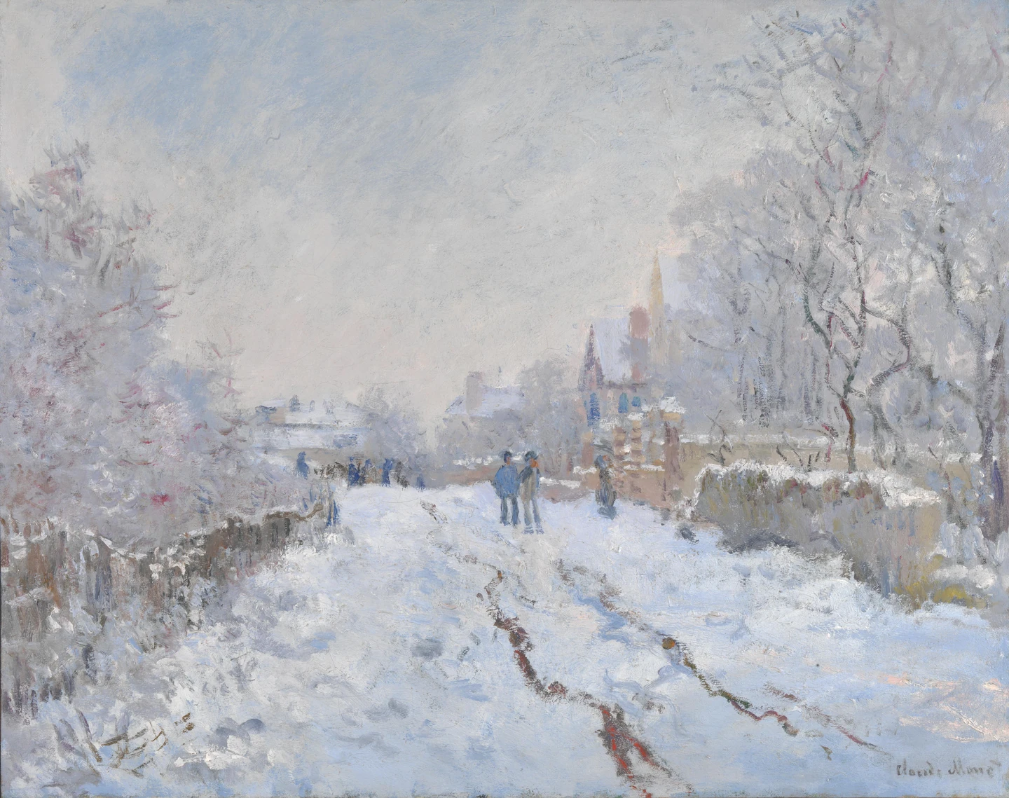
Here, the National Gallery describes an overcast afternoon, with whites, blues and greys warmed by pink tones. The painting dates from 1875. Compare its more subdued street with the brighter feeling of The Magpie; snow does not force a painter into one mood.
Start with the road. Follow its marks into the distance, then look at the darker trees on either side. Which parts feel firm and close, and which seem to soften as they recede? Now compare the amount of dark paint with the pale areas.
You are not being asked to choose a winner. The useful discovery is that the same broad subject—winter snow—can support different arrangements of light, edges and colour. “Snow scene” is the beginning of the description, not its conclusion.
Borrow the question, not the whole painting
You can explore the idea without waiting for snow. Place a white sheet of paper on a table in ordinary daylight, then fold one end upward. Keep the setup simple and look from one position.
Ask yourself three things before drawing:
- Which area looks lightest? Compare the flat part with the upright fold rather than assuming all white paper looks identical.
- Where is the main darker shape? Look for the shape of the shadow instead of putting a heavy outline around every edge.
- Is there a colour difference I can actually see? If not, do not invent blue just because you saw it in Monet.
The fold is only a small observation exercise suggested here, not a reconstruction of Monet’s working method. You can use it to practise separating the object you know from the differences in front of you.
Make a small study with a useful stopping point
Use a pencil, or a few coloured pencils if you already have them. No special shopping list is necessary. Draw the paper’s broad shape lightly, leave its lightest area mostly untouched, and add the main darker area with simple marks.
With coloured pencils, try a small mark on scrap paper before filling a large area. Compare it with your subject. Is it too dark, too vivid or simply the wrong colour? Change one thing rather than covering the whole sketch with more layers.
Stop after you can name one useful difference. For example: “I left the flat part lighter and made the upright fold slightly darker.” Keep that note beside the sketch. A modest observation you can repeat is worth more than declaring the whole attempt a success or a failure.
If you want a second familiar subject afterward, our beginner mug-drawing guide explores proportions, openings and broad shadow shapes.
Three habits that make looking more rewarding
- Compare two areas before naming one. “Darker than the sky” gives you a relationship; “grey” alone may not.
- Return from the detail to the whole. A lovely blue mark can still be too strong for the rest of your picture. Look at the composition again.
- Keep observation separate from interpretation. “There is a small dark bird on the gate” is visible. What that bird symbolizes is a different question, not something its shape proves.
For another playful way into art, explore our guide to paintings that fool the eye. You do not need specialist vocabulary to enjoy either subject. Give one detail your attention, compare it with what surrounds it, and let the next question follow.
The nicest result of this little winter lesson may happen far from a museum: noticing that an ordinary white wall, cup or sheet of paper is less visually ordinary than you thought.
Artworks, sources and image credits
Cover: Claude Monet, The Magpie, 1868–1869, Musée d’Orsay, Paris. Image source credit: Musée d’Orsay / RMN / Patrice Schmidt. Faithful artwork reproduction from the Google Art Project via Wikimedia Commons, identified there with the Public Domain Mark. The second artwork is credited in its caption. These are real paintings, not newly generated illustrations.
The museum accounts linked above support the historical details and descriptions; Getty supplies the colour vocabulary. The comparisons and paper exercise are editorial suggestions, not a claim of an in-person examination, conservation analysis or measured art-training result.
Both images reproduce historical paintings, not outdoor photographs or AI recreations. Preparation used proportional resizing and WebP conversion without colour enhancement or added elements. Both language versions use the same images; sources and public-domain status are credited above.





What do you think?
Share your thoughts or experience. Keep the conversation kind and on topic.
Participation Rules
نريدك أن تكون مصدرًا لزملائك من القراء ونأمل أن تستخدم قسم التعليقات لإجراء ذلك. لقد صممناها لرفع وتوسيع الاستجابات الأكثر ذكاءً وإدانةً ، وتقليل أو إخفاء الأسوأ. هذه هي قواعد الطريق:
ابقى في صلب الموضوع
عند تقديم تعليق ، لا تخرج عن الموضوع. لا تعلق على المعلقين الآخرين أو معتقداتهم السياسية المفترضة. ناقش مزايا القصة نفسها. لا تنشر تومي. هذا ليس المكان المناسب لصق فصل من رسالتك (أو أي شخص آخر) أو ورقة بيضاء.
أظهر الإحترام.
نحن نشجع ونقدر النقاش العميق. ما عليك سوى التأكد من أنه عندما لا تتفق مع فرضية القصة أو أي معلق آخر ، فإنك تفعل ذلك بطريقة محترمة ومهذبة.
كن مهذبا وحافظ على نظافته
نحن نغطي التكنولوجيات الجديدة موقعنا ليس منفذاً للفظاظة. نحن لا نتسامح مع الإهانات الشخصية ، بما في ذلك استدعاء الأسماء أو العنصرية أو التمييز الجنسي أو الكلام الذي يحض على الكراهية أو الفحش. هذا يعني أنه لا توجد أي ملاحظات بذيئة أو مسيئة أو مضايقة أو تنمر. إذا لم تكن مدنيًا ومهذبًا ، فلا تنشره.
تجاهل المتصيدون
أفضل رد على القزم - شخص ما يتكرر عدائيًا واستفزازًا - ليس ردًا. من فضلك لا تشجع السلوك السيئ عن طريق الاستجابة ؛ انها لا تخدم سوى لسرور المتصيدون والبيض عليها. إذا كان هناك شخص ما يسيء استخدام موضوع مناقشة ، فأبلغ عن أي تعليقات مسيئة ، وسنتناول الموقف.
كن مسؤولاً وأصيلاً
انشر آرائك فقط بكلماتك الخاصة. أنت مسؤول عن المحتوى الذي تنشره.
لا تنشر رسائل غير مرغوب فيها أو إعلانات
إذا لم يكن لديك عقد إعلان معنا ، فإن هذا الموقع الإلكتروني ليس عبارة عن لوحة إعلانات لنشاطك التجاري. لا تنشر محتوى غير مرغوب فيه أو محتوى ترويجي ذاتي أو حملات إعلانية. لا ضغط أو تجنيد أو استجداء.
نقرأ التعليقات
على الرغم من أن مجالس مناقشاتنا لا تخضع للإشراف الرسمي ، إلا أننا نولي اهتمامًا وثيقًا بها. نحتفظ بالحق في تعديل أو حذف التعليقات التي لا تلبي معاييرنا.
نحن نحظر الأعضاء الفاضحين
إنه ليس شيئًا نتمتع به. ولكن عند الضرورة ، سنحظر الأعضاء الذين لا يلتزمون بهذه الإرشادات.
شكرا على اتباع هذه المبادئ التوجيهية.